After a few mentions in various blogs of the home country's best interiors mag, Canadian House and Home, which I used to buy every now and again years ago, I decided to check out their blogs.
It is interesting, looking at the spaces now, after a few years as an expat in Britain, how different North American decor looks to me now. I find many of the spaces seem very sterile, new and dull.
The image above from their website is an example. Lovely room - looks of juicy hits of colour in a calming, neutral space. But it just feels...empty and souless. Like a showroom. Everything is too new and crisp.
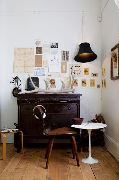
Maybe I have just been too influenced by Sibella Court's style of flea market madness. I have mentioned her in previous posts. Her eclectic way of putting old finds with beautiful patinas and natural materials peronalise spaces in a way you just can't 'purchase' at Pottery Barn!
There is something incredibly 'individual' about these kind of rooms where loved items have been collected over time and are cherished for all their knocks and imperfections.
One great thing I did find through the House and Home site was a link to this bedroom photo by NY photographer Douglas Friedman, so I went over to his site to check it out.
I love the way the vintage prints have been used as an 'extended headboard'.
Look at these yummy, sunny shots. The one below makes you want to take a seat with a nice glass of something bubbly!
Apparently he has done quite a few 'celebrity' shoots, which are a bit more formal, but I have to say- I really, REALLY hate the pretentious shots with the homeowners in them. They are so naff and grotesque they embarrass me! It is odd how strongly I react to them...like I can't look at them directly for some reason.
Is that a little...odd? (!)


No comments:
Post a Comment